
Page 237 - Ai Book - 10
P. 237
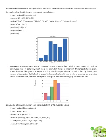
You should remember that  this type of chart also works on discontinuous data and is made at uniform intervals.

        Let us plot a bar chart in Jupyter notebook through Python.
              import matplotlib.pyplot as plt
              marks = [10,20,70,60,50,80]

              plt.bar([“Eng”, “Computers”, “Maths”, “Hindi”, “Social Science”, “Science”],marks)
              plt.title(‘Bar Chart’)
              plt.xlabel(‘Subjects’)
              plt.ylabel(‘Marks’)

              plt.show()


         u   Histogram: A histogram is a way of organising data in  graphical form which is most commonly used for
             continuous data . It looks very much like a bar chart, but there are important differences between them.
             In simple terms, histogram is a way of providing visual interpretation of numerical data by showing the
             number of data points that fall within a specified range of values. It looks similar to a vertical bar graph.You
             should remember that, likewise, a bar graph, histogram doesn’t show any gap between the bars.


        Let us draw a histogram to represent marks out of 100 of 40 students in class.

              import matplotlib.pyplot as plt
              import numpy as np

              fig,ax = plt.subplots(1,1)
              marks = np.array([10,20,49, 57,89, 70,60,50,80])
              ax.hist(marks, bins = [10,20,30,40,50])
              ax.set_title(“Histogram of result”)


                                                                                                             111
                                                                                                             111