
Page 232 - Ai Book - 10
P. 232
Matplotlib Package to Plot Data
In Python, we can easily visualise data using the Matplotlib package. The different kinds of plotting the data
using this package are as follows:
u Scatter Plot: Scatter plots are also known as scatter graphs and these graphs are similar to line graphs. A
line graph uses a line on an X-Y axis to plot a continuous function, while a scatter plot uses dots to represent
individual pieces of data. In simple terms, scatter plots are used for discontinuous data.
The two types of scatter plot are 2D and 3D. While drawing a 2D scatter plot, there is a limitation that you
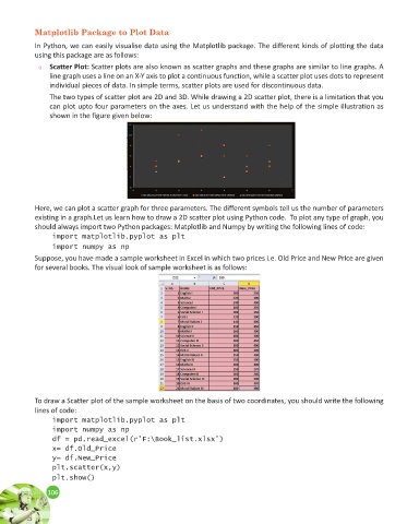
can plot upto four parameters on the axes. Let us understand with the help of the simple illustration as
shown in the figure given below:
Here, we can plot a scatter graph for three parameters. The different symbols tell us the number of parameters
existing in a graph.Let us learn how to draw a 2D scatter plot using Python code. To plot any type of graph, you
should always import two Python packages: Matplotlib and Numpy by writing the following lines of code:
import matplotlib.pyplot as plt
import numpy as np
Suppose, you have made a sample worksheet in Excel in which two prices i.e. Old Price and New Price are given
for several books. The visual look of sample worksheet is as follows:
To draw a Scatter plot of the sample worksheet on the basis of two coordinates, you should write the following
lines of code:
import matplotlib.pyplot as plt
import numpy as np
df = pd.read_excel(r’F:\Book_list.xlsx’)
x= df.Old_Price
y= df.New_Price
plt.scatter(x,y)
plt.show()
106
106