
Page 233 - Ai Book - 10
P. 233
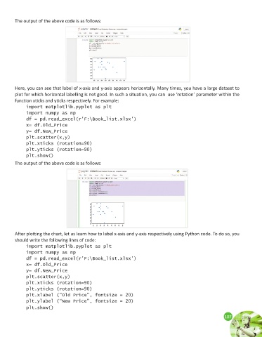
The output of the above code is as follows:


        Here, you can see that label of x-axis and y-axis appears horizontally. Many times, you have a large dataset to
        plot for which horizontal labelling is not good. In such a situation, you can  use ‘rotation’ parameter within the
        function xticks and yticks respectively. For example:

              import matplotlib.pyplot as plt
              import numpy as np
              df = pd.read_excel(r’F:\Book_list.xlsx’)
              x= df.Old_Price
              y= df.New_Price
              plt.scatter(x,y)
              plt.xticks (rotation=90)
              plt.yticks (rotation=90)
              plt.show()
        The output of the above code is as follows:


        After plotting the chart, let us learn how to label x-axis and y-axis respectively using Python code. To do so, you
        should write the following lines of code:
              import matplotlib.pyplot as plt
              import numpy as np
              df = pd.read_excel(r’F:\Book_list.xlsx’)
              x= df.Old_Price
              y= df.New_Price
              plt.scatter(x,y)
              plt.xticks (rotation=90)
              plt.yticks (rotation=90)
              plt.xlabel (“Old Price”, fontsize = 20)
              plt.ylabel (“New Price”, fontsize = 20)
              plt.show()
                                                                                                             107
                                                                                                             107