
Page 238 - Ai Book - 10
P. 238
ax.set_xlabel(“marks”)
ax.set_ylabel(“Number of Students”)
plt.show()
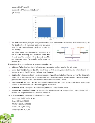
u Box Plots: In statistics, box plot is a type of chart which is often used in exploratory data analysis to display
the distribution of numerical data and skewness
using the techniques of data quartiles or percentiles
and averages.
Box plots show the five-number summary of a
set of data: including the minimum score, first
(lower) quartile, median, third (upper) quartile,
and maximum score. The box plot is also known as
whisker plot.
The detailed description of these parameters are as follows:
u Minimum Value: In a box plot, the lowest score, excluding outliers is called the min value.
u Lower Quartile(Q1): Lower Quartile, also known as first quartile, refers to the point where twenty-five
percent of scores that fall below the lower quartile value.
u Median: Sometimes, median is also known as second quartile as it displays the mid-point of the data and is
shown by the line that divides the box into two parts. In simple words, we can say that, half the scores are
greater than or equal to this value and half are less than the median value.
u Third Quartile(Q3): Third Quartile, also known as upper quartile, refers to the point where seventy-five
percent of the scores that fall below the upper quartile value.
u Maximum Value: The highest score excluding outliers is called the max value.
u Interquartile Range(IQR): IQR is the box plot that shows the middle 50% of scores. Or we can say that it
displays the range between 25th and 75th percentile.
Let us draw a Box Plot in Python using boxplot() function.
import matplotlib.pyplot as plt
Eng = [10,50,60,70,80]
Maths = [20,30,60,70,80]
Hindi = [40,60,80,70,50]
Comp = [78,89,76,87,65]
112
112