
Page 236 - Ai Book - 10
P. 236
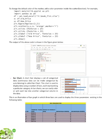
To change the default color of the marker, add a color parameter inside the scatter(function). For example,

                 import matplotlib.pyplot as plt
                 import pandas as pd
                 df = pd.read_excel(r’F:\Book_list.xlsx’)
                 x= df.Old_Price
                 y= df.New_Price
                 plt.figure(figsize=(2,2))
                 plt.scatter(x,y,c= ‘orange’,marker=’^’)
                 plt.xticks (fontsize = 20)
                 plt.yticks (fontsize = 20)
                 plt.xlabel (“Old Price”, fontsize = 20)
                 plt.ylabel (“New Price”, fontsize = 20)
                 plt.show()
            The output of the above code is shown in the figure given below:


             u   Bar Chart: A chart that displays a set of categorical
                data (continuous  data can  be made categorical  by
                auto-binning) is called Bar Chart. This chart is used to
                display data using a number of bars, each representing
                a particular category. In bar charts, we can easily color
                or split each bar into another categorical column in
                the data.

            This is an illustration of bar graph in which three bars are used to display the three parameters  existing in the
            following table:


                110
                110