
Page 155 - Revised Maths Wisdom Class - 6
P. 155
Data Handling and Presentation 153
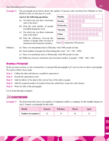
Example 3: The pictograph given below shows the number of persons who travelled from Mumbai to New
Delhi by train on each day of a week.
Answer the following questions: Monday
(a) On which day was there maximum Tuesday
rush in the train?
(b) Find the total number of people Wednesday
travelled during the week. Thursday
(c) On which day was there minimum
rush in the train? Friday
(d) Find the difference between the Saturday
number of people who travelled in
maximum and minimum numbers. Each represents 100 persons.
Solution: (a) There was maximum rush on Thursday with 1000 people in train.
(b) Total number of people travelled during the week = 42 × 100 = 4200.
(c) There was minimum rush on Wednesday with 400 people in train.
(d) Difference between maximum and minimum number of people = 1000 – 400 = 600.
Drawing a Pictograph
In the previous section, we have learned how to interpret the pictograph. Let’s now try how to draw a pictograph.
We need to follow these steps:
Step 1: Collect the data and choose a symbol to represent it.
Step 2: Decide the appropriate scale.
Step 3: Add the labels of the data to the vertical line of the table or graph.
Step 4: Add the required number of symbols from the symbol key as per the scale chosen.
Step 5: Write the title of the pictograph.
Let us learn through examples.
ILLUSTRATIONS
Example 1: The following table shows the number of computers sold by a company for the months January to
April. Prepare a pictograph for the table.
Month January February March April
Number of computers 25 35 20 15