Page 24 - Code & Click - 7
P. 24
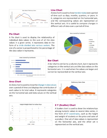
Line Chart
                                                             A Line chart is used to show trends in data over a period
                                                             of time such as days, months, quarters, or years. In
                                                             it, categories are represented on the horizontal axis,
                                                             and  the  corresponding  values  are  represented  on
                                                             the vertical axis. It is useful to compare changes in
                                                             different sets of data over a period of time.


            Pie Chart
            A Pie chart is used to display the relationship  of
            individual  data values to the sum of all the data
            values in a given series. It represents data in the
            form of a circle divided into various sectors. The
            size of a sector is proportional to the percentage of
            the data value it represents.


                                                         Bar Chart

                                                         A Bar chart is similar to a column chart, but it represents
                                                         categories on the vertical axis and the data values on the
                                                         horizontal axis. It is used when the values are larger and
                                                         cannot be represented on the vertical axis.


            Area Chart
            An Area chart is used to show the change in data values
            over a period of time and displays the contribution of
            each value to its total value. It represents categories
            on the horizontal axis and data values on the vertical
            axis.


                                                                  X Y (Scatter) Chart
                                                                  A Scatter chart is used to show the relationships
                                                                  among numeric values in several data series, in
                                                                  the form of XY coordinates, such as the height
                                                                  and weight of students or the price and sales of
                                                                  a product. One set of data values is represented
                                                                  on  the  horizontal  axis,  and  the  other  set  is
                                                                  represented on the vertical axis.


            22

