Page 25 - Code & Click - 7
P. 25
Funnel Chart

            A Funnel chart is used to show values across multiple
            stages of a process, from the initial stage to the final
            stage. The  data values  are usually  in  increasing or
            decreasing order, making the chart resemble a funnel.
            The categories are represented on the vertical axis,
            and the values are represented as rectangular bars.

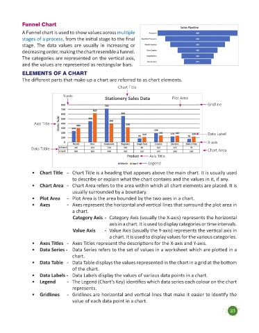
            ELEMENTS OF A CHART
            The different parts that make up a chart are referred to as chart elements.

                                                           Chart Title
                                Y-axis
                                                                                     Plot Area
                                                                                                      Gridline


                  Axis Title

                                                                                                      Data Label
                                                                                                      X-axis
                Data Table                                                                            Chart Area

                                                                          Axis Title
                                                                         Legend
                 •  Chart Title   -    Chart Title is a heading that appears above the main chart. It is usually used
                                    to describe or explain what the chart contains and the values in it, if any.
                 •  Chart Area   -    Chart Area refers to the area within which all chart elements are placed. It is
                                    usually surrounded by a boundary.
                 •  Plot Area   -    Plot Area is the area bounded by the two axes in a chart.
                 •  Axes          -    Axes represent the horizontal and vertical lines that surround the plot area in
                                    a chart.
                                    Category Axis  -  Category Axis (usually the X-axis) represents the horizontal
                                                      axis in a chart. It is used to display categories or time intervals.
                                    Value Axis      -  Value Axis (usually the Y-axis) represents the vertical axis in
                                                      a chart. It is used to display values for the various categories.
                 •   Axes Titles   -   Axes Titles represent the descriptions for the X-axis and Y-axis.
                 •   Data Series -   Data Series refers to the set of values in a worksheet which are plotted in a
                                    chart.
                 •   Data Table   -   Data Table displays the values represented in the chart in a grid at the bottom
                                    of the chart.
                 •   Data Labels -   Data Labels display the values of various data points in a chart.
                 •   Legend       -   The Legend (Chart’s Key) identifies which data series each colour on the chart
                                    represents.
                 •   Gridlines   -   Gridlines are horizontal and vertical lines that make it easier to identify the
                                    value of each data point in a chart.


                                                                                                                 23

