Page 31 - Computer - 7
P. 31
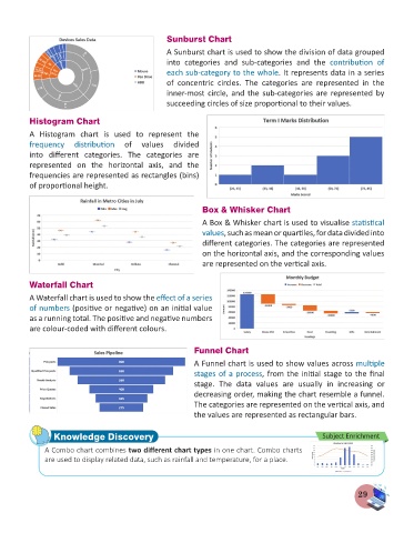
Sunburst Chart

                                                    A Sunburst chart is used to show the division of data grouped
                                                    into  categories  and  sub-categories  and  the  contribution  of
                                                    each sub-category to the whole. It represents data in a series
                                                    of  concentric  circles.  The  categories  are  represented  in  the
                                                    inner-most circle, and the sub-categories are represented by
                                                    succeeding circles of size proportional to their values.


          Histogram Chart
          A  Histogram  chart  is  used  to  represent  the
          frequency  distribution  of  values  divided
          into  different  categories.  The  categories  are
          represented  on  the  horizontal  axis,  and  the
          frequencies are represented as rectangles (bins)
          of proportional height.


                                                               Box & Whisker Chart
                                                               A Box & Whisker chart is used to visualise statistical
                                                               values, such as mean or quartiles, for data divided into
                                                               different categories. The categories are represented
                                                               on the horizontal axis, and the corresponding values
                                                               are represented on the vertical axis.


          Waterfall Chart
          A Waterfall chart is used to show the effect of a series
          of numbers (positive or negative) on an initial value
          as a running total. The positive and negative numbers
          are colour-coded with different colours.


                                                            Funnel Chart
                                                            A Funnel chart is used to show values across multiple
                                                            stages of a process, from the initial stage to the final
                                                            stage.  The  data  values  are  usually  in  increasing  or
                                                            decreasing order, making the chart resemble a funnel.
                                                            The categories are represented on the vertical axis, and
                                                            the values are represented as rectangular bars.


                 Knowledge Discovery                                                               Subject Enrichment
               A Combo chart combines two different chart types in one chart. Combo charts
               are used to display related data, such as rainfall and temperature, for a place.


                                                                                                              29

