Page 30 - Computer - 7
P. 30

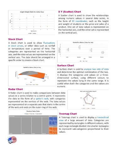
X Y (Scatter) Chart
                                                                A  Scatter  chart  is  used  to  show  the  relationships
                                                                among  numeric  values  in  several  data  series,  in
                                                                the  form  of  XY  coordinates,  such  as  the  height
                                                                and weight of students or the price and sales of a
                                                                product. One set of data values is represented on
                                                                the horizontal axis, and the other set is represented
                                                                on the vertical axis.


          Stock Chart
          A  Stock  chart  is  used  to  show  fluctuations
          in  stock  prices,  or  other  data  such  as  rainfall
          or  temperature  over  a  period  of  time.  The
          categories  are  represented  on  the  horizontal
          axis, and the data values are represented on the
          vertical axis. The data should be arranged in a
          specific order to create a Stock chart.

                                                               Surface Chart

                                                               A Surface chart is used to analyse two sets of data
                                                               and determine the optimal combination of the two.
                                                               It  displays  the  categories  and  values  on  a  three-
                                                               dimensional  surface,  using  different  colours  to
                                                               represent  the  values  lying  in  the  same  range.  It  is
                                                               useful when both the categories and the values are
                                                               numeric.
          Radar Chart

          A Radar chart is used to make comparisons between data
          values in a series relative to a centre point. It represents
          the  data  in  the  form  of  a  spider’s  web,  with  categories
          represented on the vertices of the web. The data values
          are represented on a separate axis that starts in the centre
          of the web and ends on the outer ring of the web.


                                                                 Treemap Chart
                                                                 A Treemap chart is used to display a hierarchical
                                                                 view  of  a  large  amount  of  data.  Categories  are
                                                                 represented by rectangles in different colours, with
                                                                 each large rectangle divided into smaller rectangles
                                                                 to  represent  sub-categories  proportional  to  their
                                                                 values.


               28
   25   26   27   28   29   30   31   32   33   34   35