Page 197 - Maths Skills - 8
P. 197
Data Handling                                                                                          195


        HISTOGRAM
        The graphical representation of grouped data is called a histogram. It consists of rectangles with class intervals
        as the bases and the corresponding frequencies as heights, such that there is no gap between any two successive
        rectangles.
        We follow these steps for drawing histograms:
        Step 1:  The class intervals of the grouped data are drawn on the X-axis.
        Step 2:  The frequencies are plotted on the Y-axis.

        Step 3:  The rectangles drawn are proportional to the frequencies of their classes.


              Let’s Attempt


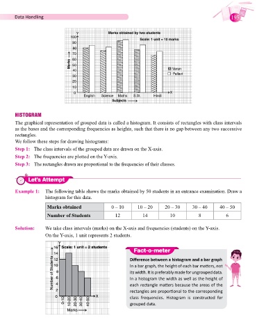
        Example 1:  The following table shows the marks obtained by 50 students in an entrance examination. Draw a
                       histogram for this data.

                       Marks obtained                 0 – 10       10 – 20      20 – 30      30 – 40      40 – 50

                       Number of Students               12           14           10            8            6

        Solution:      We take class intervals (marks) on the X-axis and frequencies (students) on the Y-axis.

                       On the Y-axis, 1 unit represents 2 students.


                                                                 Fact-o-meter

                                                               Difference between a histogram and a bar graph
                                                               In a bar graph, the height of each bar matters, not
                                                               its width. It is preferably made for ungrouped data.
                                                               In a histogram the width as well as the height of
                                                               each rectangle matters because the areas of the
                                                               rectangles are proportional to the corresponding
                                                               class  frequencies.  Histogram  is  constructed  for
                                                               grouped data.

