Page 196 - Maths Skills - 8
P. 196
194                                                                                                  Maths

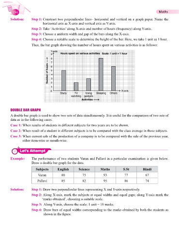
        Solution:      Step 1:    Construct two perpendicular lines– horizontal and vertical on a graph paper. Name the
                              horizontal axis as X-axis and vertical axis as Y-axis.
                       Step 2:  Take ‘Activities’ along X-axis and number of hours (frequency) along Y-axis.
                       Step 3:  Choose a uniform width and gap of the bars along the X-axis.

                       Step 4:  Choose a suitable scale to determine the height of the bar. Here, we take 1 unit as 1 hour.
                       Thus, the bar graph showing the number of hours spent on various activities is as follows:


        DOUBLE BAR GRAPH
        A double bar graph is used to show two sets of data simultaneously. It is useful for the comparison of two sets of
        data as in the following cases.
          Case 1: When  results of students in different subjects for two years are to be shown.

        Case 2: When result of a student in different subjects is to be compared with the class average in those subjects.
        Case 3:  When current sale of the production of a company is to be compared with the sale of the previous year,
                either item-wise or month-wise.


               Let’s Attempt


        Example:       The performance of two students Varun and Pallavi in a particular examination is given below.
                       Draw a double bar graph for the data.

                          Subjects      English        Science        Maths          S.St          Hindi

                           Varun           80            75             93            77             67
                           Pallavi         85            82             95            86             74


        Solution:      Step 1: Draw two perpendicular lines representing X and Y-axis respectively.
                       Step 2:  Along X-axis, mark the subjects at equal widths and equal gaps; along Y-axis mark the
                              ‘marks obtained’, choosing a suitable scale.
                       Step 3:  Along Y-axis, choose the scale: 1 unit = 10 marks.
                       Step 4:   Draw bars of equal widths corresponding to the marks obtained by both the students as
                               shown in the figure.

