Page 44 - Computer - 7
P. 44
Database Subject Enrichment
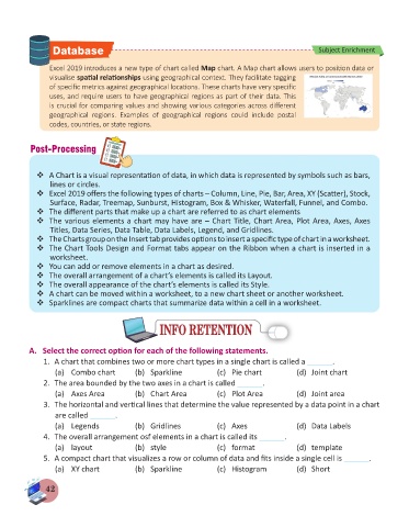
Excel 2019 introduces a new type of chart called Map chart. A Map chart allows users to position data or
visualise spatial relationships using geographical context. They facilitate tagging
of specific metrics against geographical locations. These charts have very specific
uses, and require users to have geographical regions as part of their data. This
is crucial for comparing values and showing various categories across different
geographical regions. Examples of geographical regions could include postal
codes, countries, or state regions.
Post-Processing
A Chart is a visual representation of data, in which data is represented by symbols such as bars,
lines or circles.
Excel 2019 offers the following types of charts – Column, Line, Pie, Bar, Area, XY (Scatter), Stock,
Surface, Radar, Treemap, Sunburst, Histogram, Box & Whisker, Waterfall, Funnel, and Combo.
The different parts that make up a chart are referred to as chart elements
The various elements a chart may have are – Chart Title, Chart Area, Plot Area, Axes, Axes
Titles, Data Series, Data Table, Data Labels, Legend, and Gridlines.
The Charts group on the Insert tab provides options to insert a specific type of chart in a worksheet.
The Chart Tools Design and Format tabs appear on the Ribbon when a chart is inserted in a
worksheet.
You can add or remove elements in a chart as desired.
The overall arrangement of a chart’s elements is called its Layout.
The overall appearance of the chart’s elements is called its Style.
A chart can be moved within a worksheet, to a new chart sheet or another worksheet.
Sparklines are compact charts that summarize data within a cell in a worksheet.
INFO RETENTION
INFO RETENTION
A. Select the correct option for each of the following statements.
1. A chart that combines two or more chart types in a single chart is called a ______.
(a) Combo chart (b) Sparkline (c) Pie chart (d) Joint chart
2. The area bounded by the two axes in a chart is called ______.
(a) Axes Area (b) Chart Area (c) Plot Area (d) Joint area
3. The horizontal and vertical lines that determine the value represented by a data point in a chart
are called ______.
(a) Legends (b) Gridlines (c) Axes (d) Data Labels
4. The overall arrangement osf elements in a chart is called its ______.
(a) layout (b) style (c) format (d) template
5. A compact chart that visualizes a row or column of data and fits inside a single cell is ______.
(a) XY chart (b) Sparkline (c) Histogram (d) Short
42

