Page 181 - Math Skill - 5
P. 181
Data Handling                                                                                          179

        Step 6:      The gap between each bar should be equal.

        Step 7:      Write the title of the bar graph.

        Let us learn through examples.


              Let’s Attempt

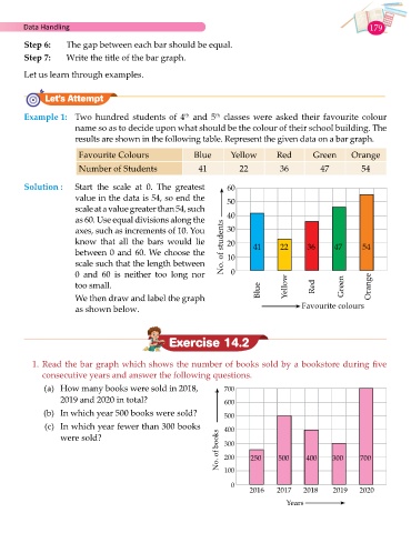
        Example 1:   Two hundred students of 4  and 5  classes  were asked their favourite colour
                                                        th
                                                                 th
                       name so as to decide upon what should be the colour of their school building. The
                       results are shown in the following table. Represent the given data on a bar graph.

                         Favourite Colours                 Blue       Yellow       Red        Green       Orange
                        Number of Students                  41          22          36          47           54


        Solution :       Start the scale at 0. The greatest          60
                       value in the data is 54, so end the           50
                       scale at a value greater than 54, such
                       as 60. Use equal divisions along the          40
                       axes, such as increments of 10. You           30
                       know  that  all  the bars  would  lie         20     41      22       36      47      54
                       between 0 and 60. We choose the             No. of students  10
                       scale such that the length between
                       0 and 60 is neither too long nor               0
                       too small.                                                     Yellow   Red     Green   Orange
                       We then draw and label the graph                       Blue
                       as shown below.                                                     Favourite colours


                                                   Exercise 14.2


          1. Read the bar graph which shows the number of books sold by a bookstore during five
              consecutive years and answer the following questions.

              (a)  How many books were sold in 2018,                700
                   2019 and 2020 in total?                          600

              (b)  In which year 500 books were sold?               500
              (c)  In which year fewer than 300 books               400
                                                                  No. of books  200  250  500  400  300     700
                   were sold?                                       300


                                                                    100

                                                                      0
                                                                           2016     2017   2018     2019    2020
                                                                                      Years

